Ecommerce Conversion Rate Optimization Guide
- Emmanuel Adesokan
- Dec 3, 2025
- 16 min read
Updated: May 18
Ecommerce conversion rate optimisation (CRO) is all about turning more of your website visitors into customers. It's a methodical process of understanding how users behave on your site and then using those insights to improve their experience. The real beauty of it? You’re making more money from the traffic you already have, without necessarily spending more to get new visitors.
Setting The Stage For Conversion Growth
Before you start tweaking button colours or rewriting product descriptions, you need a solid game plan. Jumping into random A/B tests without a clear direction is a fast track to wasted time and confusing results. The first, most crucial step in any successful CRO programme is moving beyond vague goals like "get more sales" and defining what you're actually trying to achieve.

This means getting specific about what success looks like for your business. It’s about translating broad objectives into measurable Key Performance Indicators (KPIs) that will act as your North Star, guiding your entire optimisation strategy.
Differentiating Macro and Micro Conversions
Every ecommerce site has one ultimate goal, the big one: the macro-conversion. For us, that’s a completed purchase. It’s the final action that drives revenue and the metric everyone from the CEO down is watching. But fixating only on this final step is a classic mistake that leaves a goldmine of data untouched.
Think of the customer journey as a series of smaller steps. These are your micro-conversions—crucial little actions that signal a user is engaged and moving closer to making a purchase. Tracking these is absolutely vital for diagnosing where your sales funnel is leaking.
A few examples of essential micro-conversions include:
Adding an item to the shopping basket
Signing up for your newsletter or SMS alerts
Creating a customer account
Using the search bar to find a specific product
Spending more than 30 seconds on a key product page
By tracking both macro and micro-conversions, you get a much richer, more complete picture of user intent. For example, a high "add to basket" rate but a low final purchase rate screams that the problem isn't your product pages—it's somewhere in your checkout process.
Establishing Realistic Benchmarks
To know if your efforts are paying off, you need to know where you're starting from. The first order of business is establishing your current conversion rate. But what’s a "good" rate to aim for? Honestly, this number varies wildly depending on your industry, average product price, and where your traffic is coming from.
For a bit of context, recent data shows the average UK e-commerce conversion rate is around 3.4%, which is quite a bit higher than the global average of about 1.7-1.9%. Some sectors, like groceries, see even higher rates because people are making regular, essential purchases. Knowing these benchmarks helps you set targets that are ambitious but achievable.
A realistic goal isn’t about matching an industry giant overnight. It’s about achieving consistent, incremental improvements on your own numbers. A sustained lift of just 0.5% can have a massive impact on your bottom line over a year.
Your goals should be grounded in your current performance, not aspirational figures plucked from thin air. This data-first approach ensures your CRO strategy is built on solid ground from day one. Improving this foundation often starts with enhancing the customer journey, as a strong user experience (UX) is fundamental to conversion. For fashion brands looking for more specific tactics, this practical guide to improving ecommerce conversion rates offers some great targeted advice.
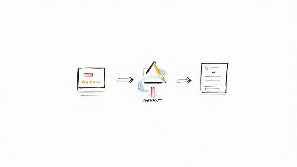
Uncovering Where Your Sales Funnel Leaks
Every single ecommerce site loses potential customers along the way—it’s just an unavoidable part of doing business online. The real question isn't if you're losing them, but where and, more importantly, why. Your job is to become a conversion detective, digging into the data to find the exact moments your carefully crafted customer journey starts to break down. This isn’t about guesswork; it's about methodical investigation.
Think of your website as a physical shop for a moment. You wouldn't want customers getting lost in cluttered aisles or abandoning their trolleys because the queue is ridiculously long. Your sales funnel is the digital equivalent, and just like a physical space, it has common problem areas where friction sends people heading for the exit. Pinpointing these drop-off points is the first real step in any effective ecommerce conversion rate optimization strategy.
Starting with Quantitative Analysis: The 'What'
Your investigation always begins with the hard numbers—the quantitative data that tells you what is happening on your site. Tools like Google Analytics 4 (GA4) are indispensable here. Don't just glance at your overall conversion rate; you need to roll up your sleeves and build a funnel exploration report to actually visualise the user's path from arrival to purchase.
Mapping out the key steps in this report is crucial. You'll want to track progress through stages like:
Viewing a product page
Adding an item to the basket
Initiating checkout
Completing the purchase
Here’s a look at what a funnel exploration report might look like inside Google Analytics 4.
A visualisation like this immediately shows you where the biggest leaks are. The steepest drop-offs are your red flags, pointing you directly to the problem areas that need your attention first.
A classic scenario we see all the time is a healthy number of users adding products to their basket, followed by a massive drop-off before they even start the checkout process. This tells you the issue probably isn't with your product appeal or pricing. It’s far more likely to be something on the basket page itself or a jarring, confusing transition to the next step.
By analysing the funnel, you move from a vague problem ("our conversion rate is low") to a specific one ("we lose 70% of users between the basket page and the first checkout step"). This specificity is the key to forming a strong, testable hypothesis.
Adding Qualitative Context: The 'Why'
Once you know where the leaks are, the next logical question is why they're happening. Numbers alone can't explain user frustration, confusion, or hesitation. For that, you need to turn to qualitative tools that reveal the human story behind the data. This is where you finally get to see your website through your customers' eyes.
Heatmaps are brilliant for this. They aggregate user behaviour into a visual overlay on your pages, showing exactly where people click, move their mouse, and scroll. You might discover that dozens of users are repeatedly clicking on an image or a piece of text that isn't actually a link, signalling a clear point of frustration and a broken user expectation.
Session recordings take this a step further. These are anonymised recordings of real user sessions on your site. Honestly, watching a few of these can be an incredibly humbling (and sometimes painful) experience. You might witness a user desperately trying to apply a discount code that doesn't work, getting stuck in an endless loop between the basket and shipping pages, or rage-clicking a button that's completely unresponsive on their mobile device.
These tools provide the rich context that analytics reports simply can't. They expose the design flaws, confusing navigation, and technical bugs that are quietly killing your conversions.
Combining the what from GA4 with the why from heatmaps gives you a powerful, evidence-based foundation for deciding what to optimise first. Without this dual-pronged approach, you're not really optimising—you're just guessing.
Building Your Prioritized Testing Roadmap
Having a big list of ideas and potential fixes is a great starting point, but let’s be honest—without a clear plan, it’s just a collection of good intentions. A successful ecommerce conversion rate optimization programme lives and dies by its ability to move from broad observations to a structured, disciplined testing process. This is where you turn your diagnostic findings into a strategic roadmap that prioritises genuine impact over guesswork.
The entire process is built on one thing: the hypothesis. A weak hypothesis is vague and unhelpful, something like, "making the checkout button bigger will increase sales." A strong, testable hypothesis, on the other hand, is specific and measurable. It directly links an action to an expected outcome and, crucially, explains why you expect it to happen.
For example, a rock-solid hypothesis might be: "By adding trust badges like Visa and PayPal to the checkout page, we'll decrease cart abandonment by 10% because it alleviates security concerns for first-time buyers." This statement is clear, it’s testable, and it’s rooted in a specific user behaviour you’ve probably observed in your data.
This flow chart perfectly illustrates how to turn those observations into action. You start by identifying where users are dropping off and then dig into the why behind their behaviour.

The real magic happens when you move from the quantitative data ('where' the problem is) to the qualitative investigation ('why' it's happening). That's the stuff great hypotheses are made of.
Prioritising Your Hypotheses
Once you've got a backlog of strong hypotheses, you face the next challenge: what do you test first? Not all tests are created equal. Some have the potential for massive returns, while others might only deliver tiny gains. Chasing every idea is a recipe for diluted focus and wasted resources.
This is where a prioritisation framework becomes your best friend. One of the most effective and straightforward models out there is the PIE framework:
Potential: How much improvement can this change realistically deliver? Focus on pages with high traffic and significant drop-off rates for the biggest potential wins.
Importance: How valuable is the traffic to this specific page? An optimisation on your main checkout page is inherently more important than a small tweak to your 'About Us' section.
Ease: How difficult will this be to implement? Consider both the technical lift and the operational effort. A simple text change is worlds away from a complete redesign of your product filtering system.
Score each hypothesis on a scale of 1-10 for each of these three criteria, then calculate your PIE score (Potential + Importance + Ease / 3). By ranking your ideas based on this score, you get a logical, data-informed order for your testing roadmap. It ensures you’re always tackling the highest-impact, lowest-effort tasks first.
Prioritisation is what stops you from getting distracted by minor cosmetic changes. It keeps your team laser-focused on tests that can genuinely move the needle on revenue. It’s the difference between being busy and being productive.
Choosing the Right Testing Method
With your prioritised list ready to go, the final piece of the puzzle is selecting the right testing methodology. The type of test you run depends entirely on the complexity of your hypothesis and what you’re trying to learn. In ecommerce CRO, you'll mainly be using one of these three.
A/B Testing (or Split Testing)This is the workhorse of conversion optimisation. You simply create two versions of a page (Version A, the control, and Version B, the variation) and show them to different segments of your audience. It’s perfect for testing a single, significant change, like a new headline, a different call-to-action colour, or adding a promotional banner. A/B testing gives you a clear winner and answers the simple question: "Does this one change improve performance?"
Multivariate Testing (MVT)Imagine you want to test a new headline, a different button text, and a new product image all on the same page. MVT lets you test multiple combinations of these elements at the same time to find the single best-performing combination. It's more complex and requires a lot more traffic to get statistically significant results, but it's incredibly powerful for understanding how different page elements interact with each other.
Split URL TestingThis is your go-to method when the changes you want to test are too significant for a simple A/B test. Think complete page redesigns or a brand-new checkout flow. Instead of changing elements on a single page, you direct traffic to two entirely different URLs. It’s the ideal choice for radical changes where the entire user experience is being overhauled.
Right, let's get down to business. All the analysis and data digging is crucial, but this is where the theory hits the tarmac. It's time to roll up our sleeves, take what we've learned, and start making tangible changes to the user experience.
This is the most exciting part of ecommerce CRO—turning insights into action and watching the results roll in.
We're going to walk through the journey stage by stage, from the moment a shopper lands on a product page to that final, satisfying click on the "Complete Order" button. This is your playbook for making the changes that actually move the needle.
Optimising Your Digital Showroom: The Product Page
Think of your product page as your best salesperson. It's where desire is sparked, questions are put to rest, and the critical decision to add an item to the basket is made. If this page misses the mark, the rest of the funnel is irrelevant.
A truly effective product page strikes a delicate balance between visual appeal, persuasive information, and rock-solid trust. Get these elements working in harmony, and you're well on your way.
Here are a few high-impact areas to focus your testing efforts:
Bring Products to Life with Rich Imagery: Don't settle for one static photo. Show off your product from every angle with high-resolution images. Better yet, include lifestyle shots that help customers see it in their world. A short video demonstration? That can be an absolute game-changer.
Write Copy That Sells, Not Just Describes: Ditch the dry, technical specs. Your copy should tell a story, solve a problem, and connect with the shopper on an emotional level. Use crisp, scannable bullet points for the key features, but weave them into a narrative that highlights the real-world benefits. Harness the Power of Social Proof: Nothing builds confidence like seeing that other people have bought and loved a product. Display customer reviews and star ratings prominently, don't hide them behind a tab. Showcasing a few of the most helpful reviews can often be more persuasive than a long, hidden list.
Your product page is far more than a simple catalogue entry. It's the most pivotal conversion point before the checkout process even begins. Every single element, from photo quality to the clarity of your returns policy, either builds momentum or creates friction.
To help pinpoint where to start, here's a quick-reference guide matching common issues to potential optimisation tactics at each stage of the funnel.
Optimisation Tactics by Funnel Stage
Funnel Stage | Common Problem | Example Optimisation Tactic |
|---|---|---|
Top of Funnel (Awareness/Discovery) | High bounce rate on landing pages | Test different hero images and headlines that align with ad copy. |
Middle of Funnel (Consideration) | Low "Add to Basket" rate on product pages | A/B test the placement and prominence of social proof (reviews, ratings). |
Middle of Funnel (Consideration) | Visitors browse but don't commit | Introduce a "Recently Viewed" section to easily resurface items. |
Bottom of Funnel (Conversion) | High basket abandonment | Offer a guest checkout option to reduce friction for new customers. |
Bottom of Funnel (Conversion) | Drop-off at the shipping/payment step | Display a progress bar to manage expectations and reduce anxiety. |
Post-Conversion (Retention) | Low rate of repeat purchases | Test personalised product recommendations in order confirmation emails. |
This table is just a starting point, of course. The real magic happens when you use your own analytics to identify the biggest leaks in your specific funnel and test solutions tailored to your audience.
Deconstructing The Seamless Checkout Process
You’ve done the hard work. You've guided a user from a product page all the way to the checkout. You are agonisingly close to a sale. At this point, your one and only goal is to eliminate every single obstacle standing in their way.
So many ecommerce stores bleed revenue right here due to completely preventable friction. One of the biggest offenders? Forcing users to create an account. For a first-time buyer, that’s a big ask and a major reason for drop-off. Always, always offer a guest checkout option.
Transparency is another massive factor. Surprise shipping costs are the number one reason people abandon their shopping baskets. Be upfront about all costs as early as possible, ideally on the basket page itself. A simple progress indicator showing the user exactly where they are in the process (e.g., Shipping > Payment > Review) also works wonders to reduce anxiety and set clear expectations. To get more hands-on ideas, you can explore these powerful conversion rate optimization techniques which detail many more practical methods.
The Surprising Power of Microcopy
Finally, never underestimate the impact of the little words—the microcopy. I'm talking about the tiny bits of text on your buttons, form fields, error messages, and tooltips. They might seem small, but their effect on a user's confidence and clarity is enormous.
Think about the difference between a button that says "Submit" versus one that reads "Get Your Free Guide". The second option is specific, focuses on the benefit, and sets a clear expectation. Or consider adding a small line of text under an email field that says, "We promise not to spam you." That simple phrase can instantly dissolve a common user fear at a critical moment.
Optimising your microcopy is all about anticipating a user's questions or hesitations and proactively answering them with a few carefully chosen words. It’s a low-effort, high-impact way to smooth out the user journey and build the trust needed to complete a purchase. These details are often just as vital as the overall design of your pages; for more on that, read our guide to build high-conversion landing pages and see how all these elements need to work together.
Using Personalisation to Boost Conversions
In a crowded market, a generic, one-size-fits-all experience is a forgotten one. To genuinely move the needle on conversions, you’ve got to make each customer feel like you’re speaking directly to them. This is where advanced segmentation and personalisation become your most powerful tools, transforming your website from a static catalogue into a dynamic, responsive shopping assistant.
The goal is simple: show the right message, to the right person, at the right time. It’s about recognising that not all visitors are the same and tailoring their journey based on who they are and what they’ve done. This builds a sense of individual recognition that fosters trust and significantly increases the likelihood of a purchase. For a deeper look at this principle, explore the power of personalization in growth marketing.
Practical Audience Segmentation Strategies
Effective personalisation all starts with smart segmentation. Instead of treating your entire audience as one monolithic group, you need to break it down into smaller, more manageable segments based on their behaviour and characteristics. This is what allows you to create highly relevant experiences that resonate on a personal level.
Some of the most impactful segments you can start with include:
New vs. Returning Visitors: A first-time visitor needs reassurance and guidance. Maybe you show them a welcome pop-up with a small discount to get them started. A returning customer already knows you, so you could greet them with new arrivals or products related to their past purchases.
High-Value Shoppers: Pinpoint the customers who have a high average order value or purchase frequently. Treat them like VIPs. Reward them with exclusive offers, early access to sales, or a loyalty programme to keep them coming back.
Location-Based Segments: Use geographic data to display location-specific promotions, highlight local delivery options, or show prices in the local currency. A customer in Manchester, for example, might see a banner for "Free Next-Day Delivery in the North West."
By segmenting your audience, you stop shouting into the void and start having meaningful conversations. It's the difference between a generic flyer and a handwritten note—one gets ignored, the other gets read.
This targeted approach lays the perfect groundwork for deploying dynamic content that truly adapts to each user's context.
Deploying Dynamic Content and Recommendations
Once your segments are defined, you can start delivering dynamic content—website elements that change automatically based on who is looking at them. This is a core tactic in ecommerce conversion rate optimisation, making your site feel alive and intelligent.
Imagine a visitor who has previously browsed hiking boots. On their next visit, instead of seeing your generic homepage banner about a sitewide sale, they're greeted with a hero image featuring your latest outdoor footwear collection. This immediate relevance grabs their attention and pulls them deeper into your site.
Personalised product recommendations are another game-changer here. By using algorithms to suggest items based on browsing history, past purchases, or what similar customers have viewed, you can significantly lift your average order value. These recommendations should pop up on product pages ("Customers also bought...") and even within the shopping basket ("Don't forget these essentials...").
The Power of Targeted Email Automation
Email is still one of the most effective channels for a personal touch. Research shows that email marketing campaigns in the UK can achieve an average conversion rate of 10.3%, largely thanks to precise segmentation.
Among the top performers are back-in-stock alerts, converting at a solid 7.28%, and abandoned cart reminders, which are absolutely crucial for recovering otherwise lost sales. For more UK e-commerce insights, you can read the full research about industry benchmarks.
Abandoned cart emails are a must-have. When someone leaves items in their basket, an automated email sent a few hours later can be incredibly effective. Make sure you include images of the items they left behind and a direct link to complete their purchase to make it as frictionless as possible.
Similarly, back-in-stock notifications re-engage shoppers who have already shown clear interest in a specific product, turning a missed opportunity into a successful sale.

At Ryesing Limited, we build data-driven growth engines for ambitious brands, turning insights into sustainable revenue. Discover how our strategic expertise can scale your business at Ryesing
Common Questions About Ecommerce CRO
As you start diving into ecommerce conversion rate optimisation, a few questions are bound to bubble up. It's a field with its own jargon and methods, but once you get past that initial learning curve, the core ideas are refreshingly straightforward.
This section is all about giving you clear, direct answers to the queries we hear most often. Think of it as your quick-start guide for handling the real-world side of CRO, from managing timelines to making it work when you're on a shoestring budget. Let's tackle these questions head-on so you can move forward with confidence.
How Long Until I See Real Results?
This is the big one, isn't it? The honest answer is: it really depends. The time it takes to see a meaningful lift in conversions hinges on a few key factors, but the most important is your website’s traffic.
A site with hundreds of thousands of monthly visitors can get statistically significant data from an A/B test in just a few days. On the other hand, a smaller shop with less traffic might need to let that same test run for several weeks to feel confident in the results.
A good rule of thumb is to aim for a test duration of at least two full business cycles. For most ecommerce sites, that’s about two to four weeks. This helps smooth out any oddities caused by weekly traffic swings or specific sales promotions.
Remember, CRO isn't about quick, one-off hacks. It's a continuous process of making small, smart improvements. The real win is building a long-term programme of testing and learning, where small, consistent gains compound over time to create serious revenue growth.
What Are the Essential Tools to Get Started?
You don't need a huge, expensive tech stack to start making an impact. In fact, you can get incredibly far with just a handful of core tools, many of which have powerful free versions.
Here’s a lean but mighty starter kit:
Analytics Platform: This is non-negotiable. Google Analytics 4 (GA4) is the industry standard, and it's completely free. This is where you’ll pinpoint funnel drop-offs and measure the impact of your experiments.
Behavioural Analytics Tools: To understand the why behind the numbers, you need to see how people actually use your site. Tools like Hotjar or Microsoft Clarity provide heatmaps and session recordings, and both offer generous free plans.
A/B Testing Software: To run controlled experiments, you need a dedicated platform. While Google Optimize is being sunsetted, its principles live on in fantastic tools like VWO or Optimizely. Many ecommerce platforms even have basic testing features built right in.
This trio, analytics, user behaviour, and testing, is the bedrock of any solid ecommerce CRO programme.
How Can I Approach CRO With a Limited Budget?
A tight budget doesn't shut you out from effective CRO; it just forces you to be more strategic and resourceful. The key is to zero in on changes that have a high potential for impact but require low technical effort.
Start by grabbing the "low-hanging fruit." Use your free analytics and heatmap tools to spot the most glaring issues. Is your mobile navigation a bit clunky? Is a key call-to-action button almost invisible? Are users rage-clicking on something that isn't even a link?
Fixing these obvious user experience problems often doesn't need a complex A/B test and can deliver an immediate boost. It's what some of us call the 'just fix it' approac, it's simple, direct, and incredibly effective.
Prioritise changes you can implement yourself. This could be rewriting confusing microcopy, beefing up your product descriptions, or adding clearer trust signals to your checkout page. Every small, positive change you make builds towards a better user experience, which is the very heart of conversion rate optimisation.